Our journey to and through the complete rebranding
After 11 years of existence, IPerity (now Talksome) is entering a new decade and with that we couldn’t help but think where and how we would like to look in another 10 years. It seemed that, as we were moving forward and developing in our services and production, our brand, image and identity was frozen in time.
Why did we do rebranding?
We started asking ourselves whether our company name, colors, website and overall image really do represent the future of the company. Branding, by definition, is a marketing practice in which a company creates a name, symbol or design that is easily identifiable as belonging to the company. However, for us, our brand was not easily identifiable as belonging to the company. It was time for a change!
Why do customers value brands? What is often important to companies in regards to branding is the association dimension: what do customers think and feel when a brand is mentioned? These questions were haunting us, until we came to the conclusion that the only solution for our troubled minds was the process of rebranding. And so it began!
What problems did we face in the past?
The process of rebranding is not easy and especially for us, the question where does one begin with such a project is hard to answer. We started with our past and present.
We were facing the following issues:
- The accent color felt like it wasn’t representable and, therefore, often avoided.
- The logo wasn’t suitable.
- The overall image and tone of voice wasn’t appropriate for the target audience.
- The information on the website was incomplete.
- The information architecture on the website wasn’t optimal.
The name of the company “IPerity” was difficult to pronounce and bring meaning to our services. Furthermore the colors of the company – pink, black and white, seemed immature, not matching with the company’s identity and self-reflection.
Two different target audiences were identified among our clients and partners. The style and guiding system of our website was too complex to reach some of our target audiences. By that meaning, our website not only did not represent fully the capacities of our team and product, but most importantly did not apply a sufficient and easy-to use interface.
The solution – rebranding!
In order to face and resolve the issues that our company is facing, we have taken the following steps that are part of a rebranding process. This process will help our company to move forward, by building a stronger relationship with our clients and resellers, and by acquiring a brand image that is associative with our values, team and services.
Product logos and names redesign
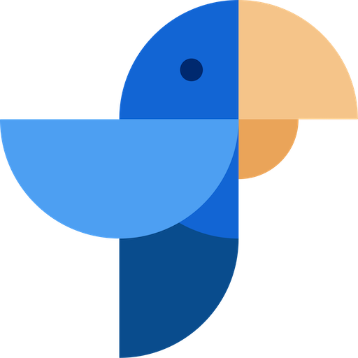
We decided to bet on blue as our primary brand colour, for trust, dependability, security and stability, because we seek to identify with those assets not only on our work, but within our team. We choose the color dusk for sophistication, power, authority and hich tech, as our main goal. The color dawn represented what we thrive for- cleanness, clarity, simplicity and freshness. Finally, the color Ibiza accompanies our vision with inspiration and smooth communication.
In addition, we are planning to re-design our product and company logos. Our logo represents technology and communication. The logo is very simple and not intrusive because we always put emphasis on what we are saying, instead of metadata. We have two versions of our logo. Original logo is meant for most situations, whereas the alternative one is meant for the situations where the original doesn’t comply with the contrast regulations. For example, the alternative logo is white and can be used on blue or dark backgrounds.
Website redesign
As our research has shown, there is a division in the levels of technical knowledge and interest amongst our clients and partners. In order to better understand, support and be reachable for our customers, we developed a guiding system, where instructions on how to use our product solutions would start from the basics and expand, where our user’s manual will be separated from the developer’s tools and support. Our website will be adoptable and functional for both of our tech- oriented and business-oriented audience.
Our website redesign process introduces new information architecture, content re-writing in a shorter and clearer style and onboarding of our main solution- Compass. The redesign process will incorporate the new rebranding (logo, colors, typography, etc.). The website will serve as the go-to place for finding information on our company products or documentation. The structure is adapted to the specific needs of each part of the website. The website will contain documentation and tutorials for our products and solutions, as well as offering a demo possibility of our product(s).
Conclusion
The year of 2021 will be an exciting year for us! If we look at what we can improve to smoothen the way people communicate, we believe that it has to be intuitive and easy. What drives us is to achieve that goal, make communication seamless, frictionless… without obstacles. The process of rebranding will help us achieve those goals, by applying a new easy-to- use website, with a new, adaptable guiding and communication system. Moreover, the redesign of product logos and brand colors will provide us the opportunity to be more reachable and identifiable to our customers and partners.
The process of rebranding will take us to a long journey, for which our company will be gradually introducing what this process entails, our new releases and updates.
Subscribe to Talksome blog
Get the latest posts delivered right to your inbox