IPerity is now Talksome! 🎉
The year of 2020 turned out to be a key year for the development and transformation of IPerity. We felt that it was time for a big change, therefore we happily rolled our sleeves up and started working!
Our vision is a world, where communication has no obstacles. In that sense, we aim to also communicate our messages, without any obstacles – the content and design of our product and resources should always be clean and without clutter. As a tech company, it’s crucial for our brand identity to resonate with our products and marketing tools, which seek to be up-to-date, modernised at all time and sleek.
We were facing some issues regarding the image and representation of the company. Our accent colour felt like it was not suitable and, therefore, often avoided. Our logo was not expressing the values of the company. The overall tone of voice wasn’t appropriate for our target audience. The architecture of the website was not optimal, while the information on it was incomplete.
But, the most important problem was, that the brand did not represent properly neither our team, our products, nor the message we want to send out. We found it irrelevant, immature and unidentifiable. Therefore, in the year of 2020 we started step by step, with determination, to go into a process of rebranding. From then on, we reconsidered every possible detail of our brand identity!
Long road to the new face.
Our journey of rebranding started with the development of a new website for the company. In order to better understand, support and be reachable for our customers, we started working towards a guiding system, where instructions on how to use our product solutions would start from the basics and expand, where our user’s manual will be separated from the developer’s tools and support. Our website will be adoptable and functional for both of our tech- oriented and business-oriented audience. As our research shows, our audience is interested in more tutorials and how-tos on our website. Therefore, based on this feedback, through the new website, we will provide documentations, tutorials and demos for or our products and solutions.
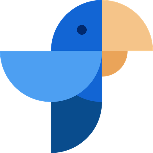
Our next step in the rebranding process involved a re-thinking of our company colours. Our previous primary colour was pink, which felt immature and hard to identify with the tech image of the company. As a result, we selected blue as a new primary colour, because it expresses calmness, trustworthiness, authority and let’s face it- looks more pleasing for the eye!
The final touch.
The final step in our rebranding journey involved a complete re-design of our logo and change of our company name. This final touch in our rebranding process was long waited and desired. The reason for that is, that the name of IPerity was pronounced with a difficulty, hard to be remembered from our customers and mismatched with the name our our main product- Compass. By that meaning, it was time for a company name that we can identify more with, is more recognisable and that translates the goals of our work in the company.
With the development of a new styling and full transformation of our image, in January 2021, we were extremely excited and happy to welcome the new year with a brand new name, which marked the end of the IPerity name era.
We chose the name “Talksome”, because we wanted to have a name that is more explanatory of what we do, create and sell. Communication is the core of our work, therefore “Talk” is a fitting synonym. The “some” can be interpreted in more than one way, as it aims to resemble our drive to be the best at what we do.
Our new logo, accompanying the name “Talksome”, is a parrot, who talks, which is created from one shape and in our new primary colour- blue. The construction of the new logo from one shape symbolises the building blocks of communication and of our main product- Compass.
Our future as Talksome-ers.
The year of 2021 is very exciting for our company and team, as we are welcoming all the changes that will construct the future of our brand identity. Our mission is to create the best modular platform, by paying attention to the finest details and supporting our partners, in improving instant communication in every way possible. We are very proud to continue working on our goals and to achieve our mission with a brand that “speaks and looks” like one that combines technical knowledge with a human approach.
Subscribe to Talksome blog
Get the latest posts delivered right to your inbox