Panel 2.0 is out now!
We have a new release of Panel 2.0! The new Panel update introduces the same features as the old Panel, but with a brand new design. Additionally, the new version of Panel 2.0 is fully tested for disruptions and bugs by our Test team. Therefore, we are proud to say that the new version is not only cleaner and more in-tone with our rebranding, but it also runs smoother than ever!
How did the old version of Panel look like?
The design of Panel’s old version was entirely based on the tone of voice from IPerity’s branding. By that meaning, the colour pink and the typography “Montserrat” were applied to the old design of Panel.
How does the new version look like?
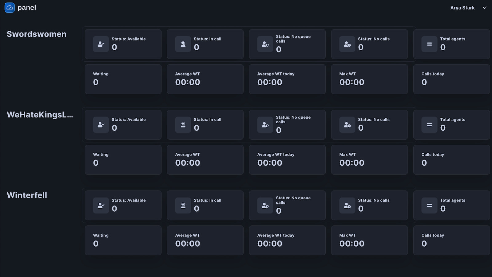
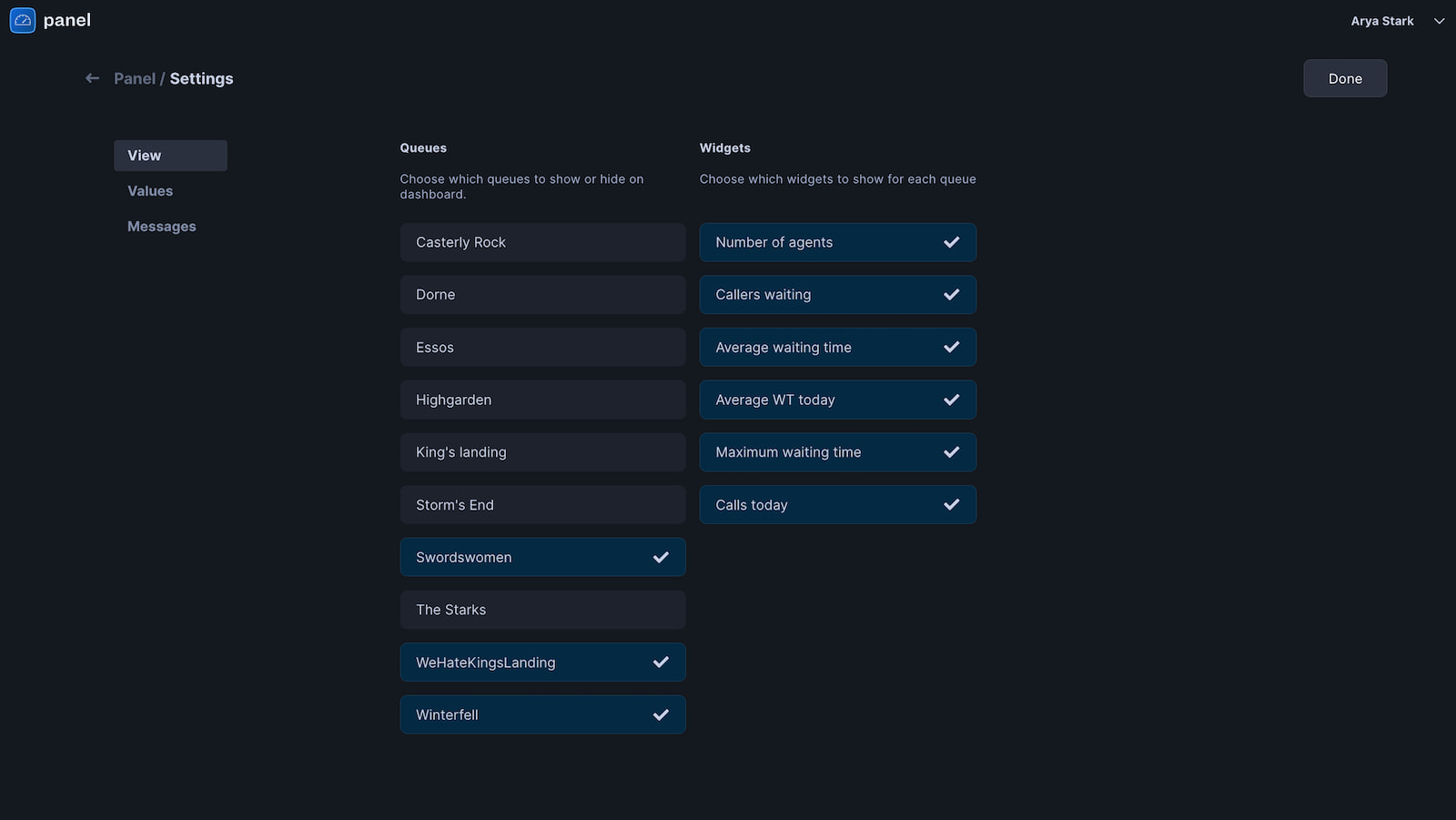
With Panel 2.0, we introduce a look that is corresponding entirely to Talksome’s brand guidelines. In particular, the new design applies the new brand colours- light and dark blue, together with the new font choice, more suitable for user interfaces - font Inter. The biggest and most noticeable change, when it comes to the new Panel version, is that now the application is designed with a dark background, instead of the light one. This change should improve the visibility of important information on big screens because it emphasizes the information on the screen instead of the screen brightness itself. Additionally, with the new design, we also introduce a new logo for Panel. The settings and features, such as the ability to choose which queues to show or hide on the dashboard, which widgets to show for each queue, to have visibility of the number of agents, callers waiting, Average and Maximum waiting time, all remain the same from the old Panel version.
Click here to explore the new version: panel.hostedcompass.com
Learn more about Panel: talksome.com/panel


Subscribe to Talksome blog
Get the latest posts delivered right to your inbox
